The Making of Revolve
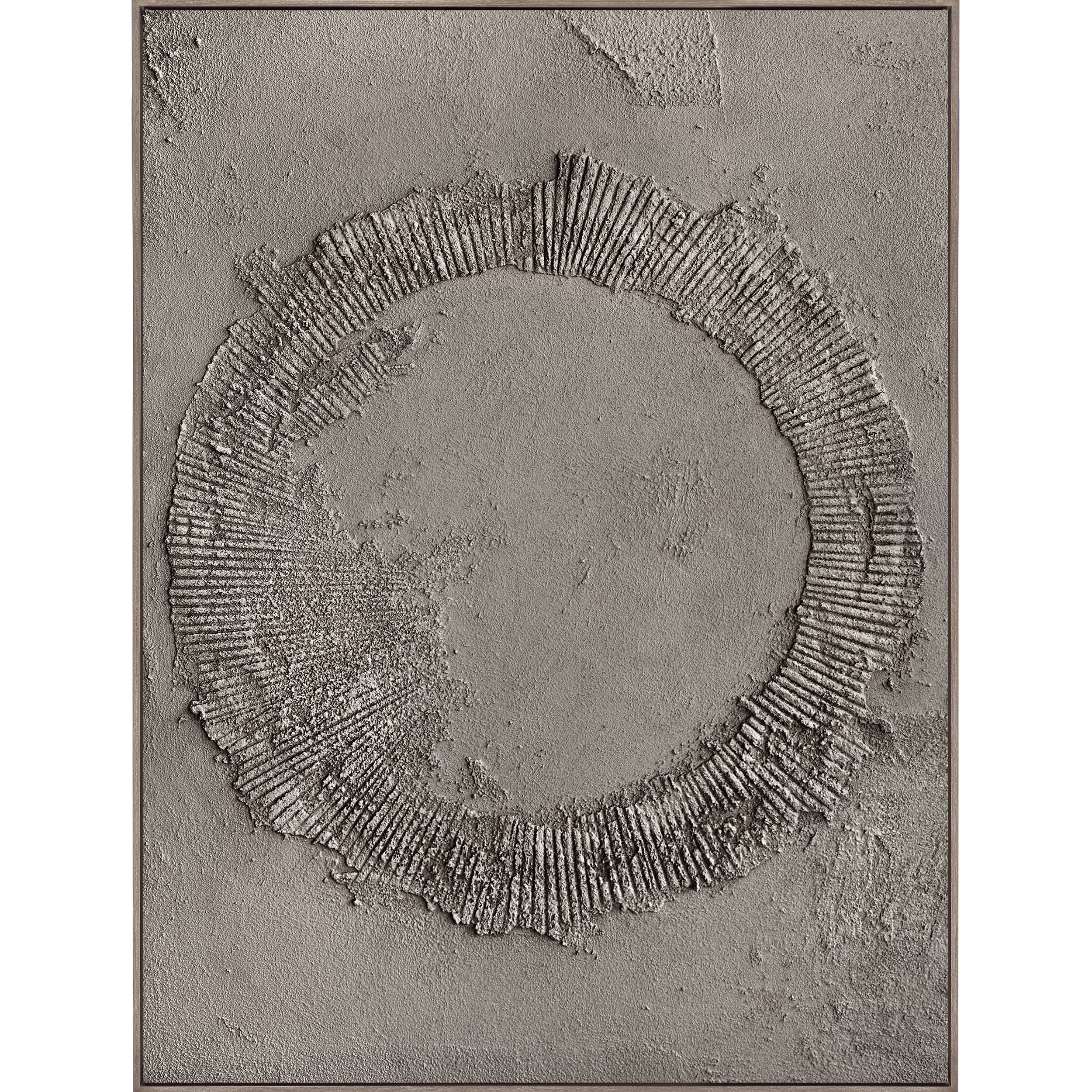
Meditative and grounding, Revolve employs a rotating circle design made from a textural medium to create an inspiring experience. Constructed out of pumice stone, acrylic, and oil paint, the artwork is created by VC artist Gintare Bandinskaite. Working with Visual Contrast since its inception, Gintare experiments with texture, color, and size to create significant and powerful artworks that have become staples in our art catalog. As the artist behind our Impressions series, a second iteration of the collection has been in the works for years to interpret the medium in a different design. Gintare presented us with Revolve: a meaningful artwork that depicts her signature textural surface in a new manner.
Gintare has always been drawn to texture as she explains, “I love weathered elements like ancient walls, antique pots, and distressed wood.” Once she began experimenting with texture in her art, it opened her up to “endless possibilities for expression and creativity.” The design for Revolve was actually inspired by another one of her artworks. “It caught my eye and looked like a fragment of a circle. I started envisioning completing the circle and that’s how the design was born.” Gintare describes her process as “fun and tactile.” She works in layers, firstly creating the background texture, then adding the circular design and carving grooves into the circle. Watching her spread the pumice stone on the canvas and sculpt the design is truly mesmerizing. The final step is painting the artwork and adding some highlights and shadows for dimension.
Revolve creates harmony through the juxtaposition of its elements. The rough texture is paired with a geometric circle composed of radiating lines of varying lengths. The irregularities of the texture and the shape challenge the perfect nature of the circle. The circle is also representative on its own as Gintare explained, “The circle is such a powerful symbol that signifies unity and wholeness. It evokes a sense of being grounded and invites introspection and contemplation.” We worked with Gintare to develop a neutral color scheme that complements our ink selection, ranging from a dark burgundy to a moody charcoal to an earthy khaki green. Gintare added, “I aimed for an earthy, warm, and muted palette that would add a sense of depth and dimension to the artwork. I felt that the darker, moodier tones complemented the design.” Our hand-finished walnut floater frames balance the color palette and ground the artworks.
As the follow-up to Impressions, Revolve resembles the previous collection while providing an updated take on the concept. Both collections are textural and monochromatic, utilizing the same medium for creation. However, the process and technique differ for both, allowing for the formation of different designs. “Impressions is characterized by free flow movement with color gradation from light to dark, whereas Revolve has a central focal point: a circle,” Gintare described. The process of creating Impressions is more unrestrained and loose, creating an abstract design, while Revolve requires more precision and focus to outline the circular pattern. The goal of both artworks is to evoke a sense of calm and connection, putting the viewer into a peaceful trance.


