Project Spotlight: Opus LA
We recently collaborated with Jamison Properties and ISO Architecture on creating the artwork for Opus Los Angeles, a brand new cosmopolitan two-tower apartment building. Located in Koreatown in the heart of Los Angeles, the building boasts a variety of amenities and benefits for the residents with thoughtful design meant to “create a new way of artistic living full of color, great food, and innovative architecture.” Inspired by both traditional and contemporary cultures, the goal of the project is to create an “incredibly polished and refined home on the inside with all the revelry and action of KTown right outside.” With “materiality inspiration from earth,” the space is flooded with natural light and many natural materials were incorporated such as wood and stone.
When building the art package for this project, we focused on creating custom artworks that would complement the size and modern design of the building. With muted colors and organic materials, we designed artworks that were sophisticated and intriguing, without distracting from the interior design. Inspired by minimalism, sustainability, and well-being, we looked to texture, neutral color, and contrast to create an art collection that represents the message and ethos of Opus LA. Juxtaposing abstract and geometric forms, dark and light color, and different textural finishes allowed us to achieve harmony in the interior and elevate the space.
From a co-working room to a game lounge to a private dining room, our artworks were designed for each space, specially tailored to the location. Each room had a different feeling but there was continuity throughout the building and we ensured our artwork reflected the character of each space while relating to the project as a whole. With the large size of many of these rooms, we had to develop some extra large concepts. Our favorites from the project were the two Impressions triptychs done for the lobbies. The building has a lobby in each tower, with gorgeous wood paneling on the walls. Our artist Gintare custom created two connecting triptych designs in her signature “Impressions” method, one in a rust colorway and the other in umber. While the artworks are powerful with their extreme size, their flowing patterns and earthy colors evoke a calming presence.
Our Revolve textural artwork is the center of attention in the private lounge, hung above a sofa. With natural light coming in from the window and the siena colorway matching the rug, the artwork creates quite the dramatic moment in the room. Made of oil paint and pumice stone, the natural light illuminates the texture on the surface and the circular design.
With a penchant for painterly strokes and abstract forms, many of the artworks in the collection have a handmade, artistic feel. The Layered Abstracts in the concessions room and Navy Abstracts in the game lounge both use a textural painting technique to create their layered compositions. With overlapping strokes in monochromatic colorways, these artworks provide a subtle pop of color to the space while adding some intrigue. The Alcohol Ink Prints in the coworking room brighten up the space with their flowing design. In a set of 4 hung above desks, they tie the room together with their varying blue hues.
We had to incorporate some of our classic silkscreens to the project! To fill a large wall in the private dining room, we created a trio of our Twilight XL silkscreens. In three different colorways, the silkscreens complement one another without being too similar and provide a bold focal point for the room. We also added in a Horizons silkscreen in ash green and warm green to a hallway for a little brightness in an otherwise dull/undecorated area.
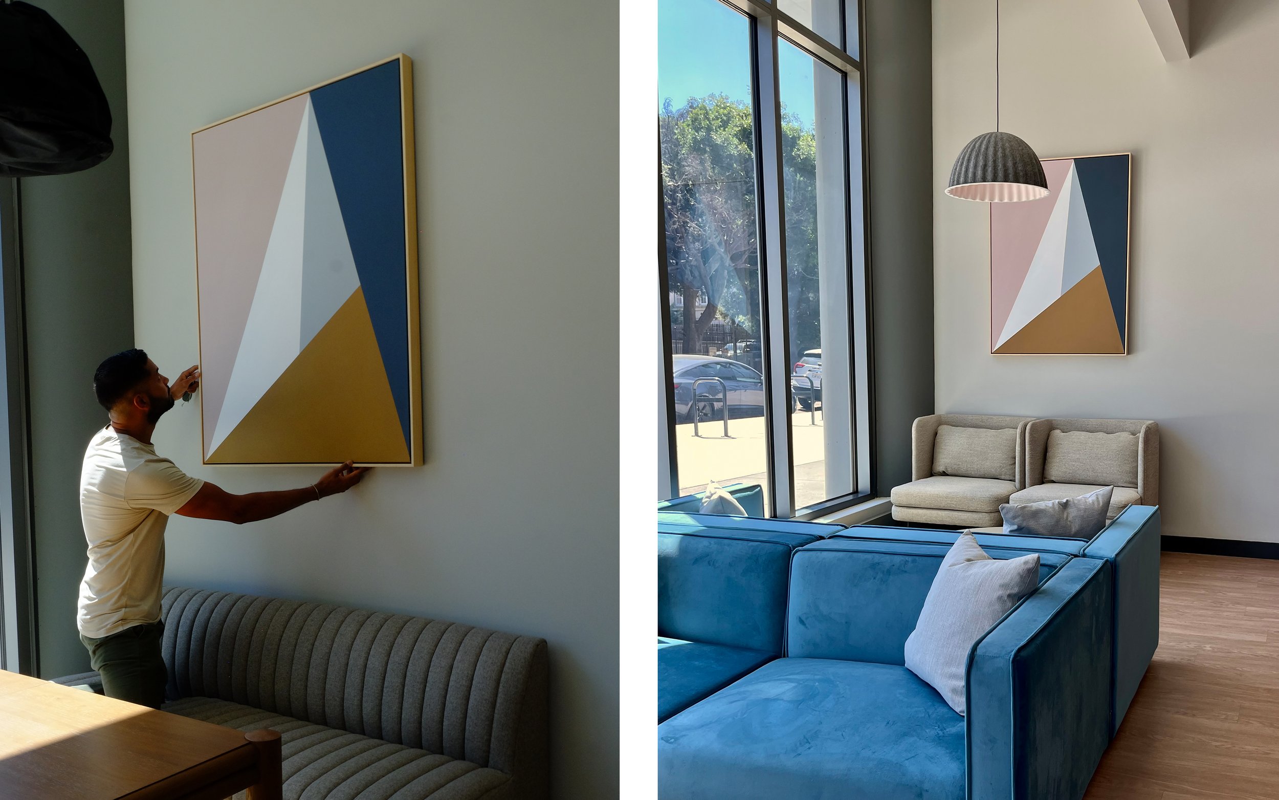
The coworking room in the north tower is on the ground floor, so we were sure to include some showstopping pieces that passerby could view from outside. We created an extra large Metallic Bands painting in the white and gold colorway to complement the banded wood paneling on the wall of the conference room. For a bold geometric moment, we included a Hyperion painting in the coworking lounge, situated above a working station. The pink, indigo, and mustard yellow colors stand out in the neutral space and the sharp design complements the different fixtures in the room.


